You need to create an effective landing page in order to increase your conversion rate. And before you get too complex in your layout, it might be best to start with some simple landing page best practices.
That’s because a landing page is the first thing that your visitors see when they arrive on your website, so it’s important that it is designed to capture their attention and persuade them to take action. After all, you’re ultimately trying to drive conversions, and your landing page quality is a key part of making that happen.
But what is it that makes a landing page effective? What are the essential elements that are certain to win over your audience and drive them to action? What is the one secret to creating a powerful landing page every time?
Well, the truth is that there is no one secret. Every landing page is a totally unique case in terms of its ability to drive conversions. It needs to be tailored to the audience and the conversion goal.
But don’t panic yet. Just because there is no quantifiable hack for making your campaigns more effective, there are some general tips and landing page best practices that can help you produce the best possible results.
For instance…
Landing Page Best Practice #1: Clean Design and Removal of Distractions
The way your site looks, feels, and is structured will have a significant impact on the effectiveness of your landing page and how well it converts.
The primary purpose of your landing page should be to make it as simple as possible for a visitor to do the thing you want them to do; therefore, all elements of your page should work toward that objective. Whether it’s filling out a form, downloading a white paper, or contacting a rep, you want all elements of your landing page driving people toward taking that action.
A well-designed landing page is going to make smart use of color and design elements. You’re also going to want to use eye-catching images where it makes sense.
Button colors like red or green are said to enhance landing page conversions, but more than anything, make sure there is a clear contrast between your button color and the background. There are several different characteristics of buttons that you should test for each landing page. Experiment with color, position, and size to see which landing page layout works best for you.
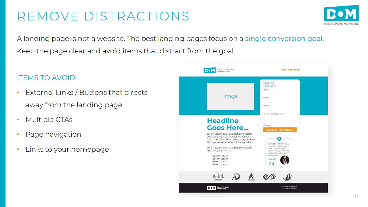
Some elements to avoid in your landing page are:
- External links and buttons that direct away from the landing page
- Multiple CTAs
- Page navigation
- Links to your homepage
Keeping your landing page clear of distractions will help visitors focus on the conversion action.
Landing Page Best Practice #2: Talk About the Offer in Your Heading and Place Content Strategically
We can’t reiterate enough how important it is to make every element of your landing page focus users on the intended conversion. And the best place to start with that is the headline.
As far as general landing page best practices go, your headline should contain your value proposition. After all, it’s the first thing the visitor will see. Your headline will likely determine whether they stick around long enough to look at anything else.
Let’s say you’re a financial firm that specializes in retirement savings. You have a white paper that is filled with great tips for saving. You want people to visit your landing page and download the white paper.
A bad headline for this would be: Financial Services for Retirement Time!
A more appropriate headline might be something like: Unlock Your Retirement Potential With This White Paper
The second headline includes the desired action for the visitor as well as a value proposition for why they should do it.
For a lot of us writers out there, it’s not always easy to take a direct approach to headlines. We like to be clever and, well, more “writer-ish.” But landing pages are not the place to be clever with headlines. You want to catch attention by offering something of value, that thing being the conversion.
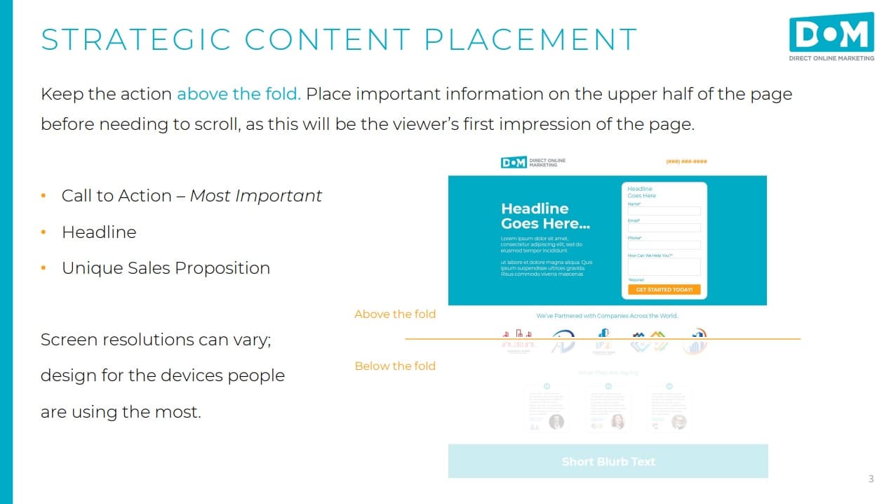
Some content that will absolutely need to be present is:
- The call to action (simply the most important component of your landing page)
- A headline that catches the viewer’s attention
- A unique sales proposition
Also be sure that all of the important information is visible on the upper half of the page. You don’t want the visitor to have to scroll to see it.
Best Practice #3: Use Authentic Social Proof
You also definitely want people to know that you’re the real deal. If a visitor hasn’t heard of you, they might be skeptical about your legitimacy or expertise. That’s where social proof comes in.
How many people has your service helped? How many things have you sold? Where might people know you from?
Even something as simple as a graphic of a world map with dots and numbers on it to show you’ve had customers in 14 different countries can help. It establishes your company as trustworthy.
You can even mention your social media following in there. Just put the count of your Facebook followers below the “follow us” button. Every little thing helps.
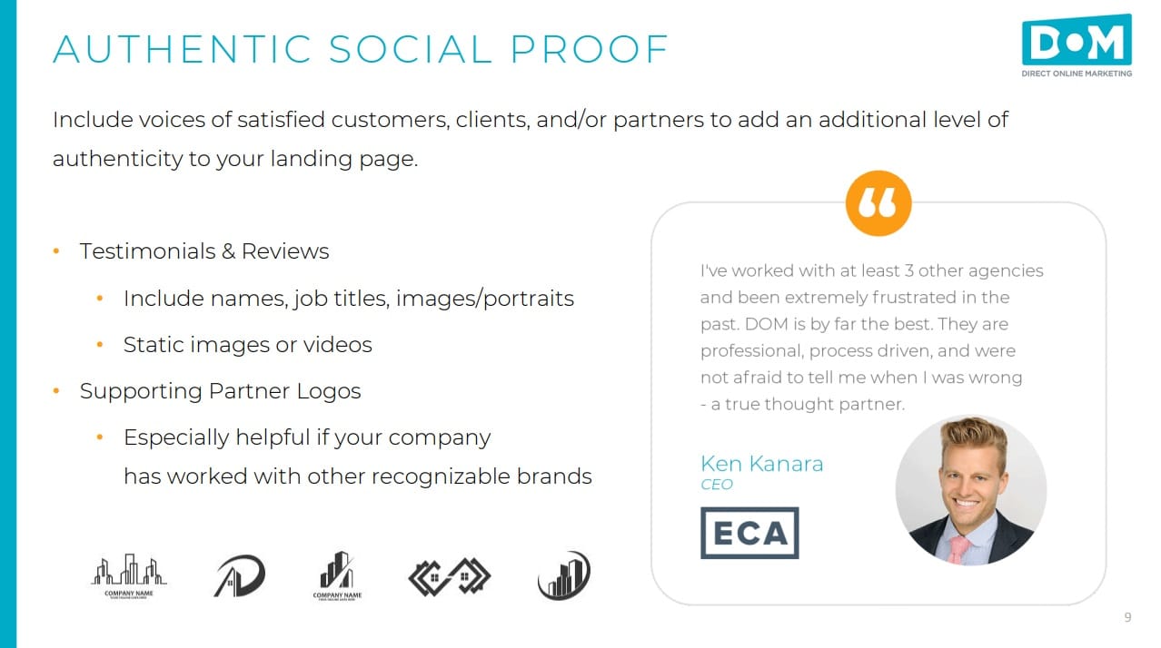
Here are some more ideas for social proof to put on your landing page:
- Testimonials and reviews. Include names, job titles, and images or portraits if you can.
- Supporting partner logos. These are especially helpful in establishing trustworthiness if your company has worked with other recognizable brands.
Best Practice #4: Keep the Form Fields Simplified
If you’re asking visitors to fill in a form, make sure that it’s a short one. This is one of those landing page best practices that gets a lot of debate. From our perspective, every second longer that you’re asking a visitor to stay on your landing page, you’re fighting the inevitable waning of their interest. Every extra field that you ask somebody to fill out decreases the chance that the form will get filled out at all.
So really think about what kind of information you need from your audience, and then keep the form to those essential fields.
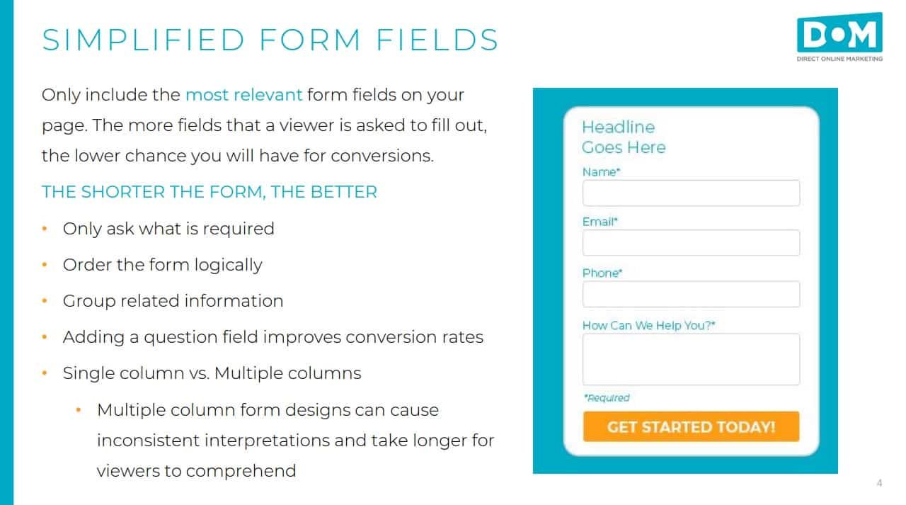
Here are some general tips for keeping your form shorter:
- Only ask for what information is required
- Logically order the form so that it makes sense
- Group related information together
- Adding a question field generally improves conversion rates
- Use a single column rather than multiple columns
Best Practice #5: A/B Testing, or Always Be Testing
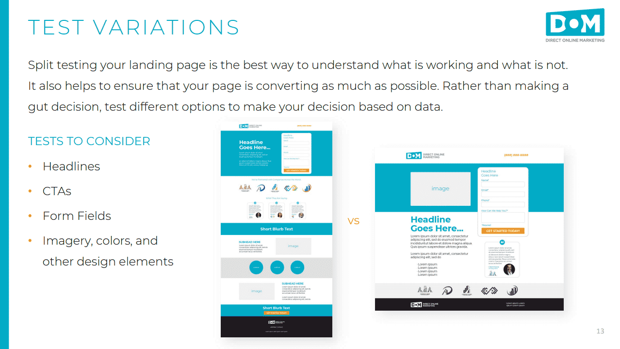
If you’re not making decisions based on data, you’re making educated guesses. While a lot of landing page creation is going to be based on educated guesses, A/B testing will give you some real-world data that can point you in the right direction.
Essentially, you’ll want to create multiple versions of your landing pages and test which version performs the best in real world practice. Then, you simply remove the other versions.
While A/B testing won’t tell you why people prefer one over the other, it will provide you with quantifiable numbers that show which landing page version will work best.
So what sort of things can you test on a landing page? Well, anything you want, though there are some areas that we find to be pretty useful.
Here are some tests to consider:
- Headlines
- CTAs
- Form fields
- Imagery, colors, and other design elements
You can dive much deeper into this topic by checking out our post filled with landing page optimization tips or reviewing C-leveled’s must have elements of an effective landing page.
We Can Help You Make Killer Landing Pages
Before telling you how effective we can be at helping you create killer landing pages… do you have a specific need in mind for building a new landing page? For instance, is it holiday themed?
If yes, then please check this out – 5 Ways to Make Your Holiday Landing Pages Stand Out – your revenue numbers at the end of the holiday rush will thank you!
Part of what we do at Direct Online Marketing is craft landing pages that get results.
We’ll work with you to create ad campaigns that drive traffic. Then we’ll complement those campaigns with conversion-driving designs that follow all of the landing page best practices.
If you or your business are struggling with making landing pages that meet your goals, contact us and find out how DOM can help. We’ll start you off with a free audit to identify any areas of concern in your digital marketing efforts.
